Like it or not, if you own a business, you’ve got to have a website.
Most business owners understand this, but unfortunately, there are far too many of them who think they can just haphazardly slap something together and that’ll be good enough.
But the fact of the matter is, if your website isn’t well-designed, it’s not going to do much for your business, and it can actually do more harm than good.
Having a website that performs poorly, looks amateurish, or doesn’t properly portray your brand can be incredibly detrimental to your business.
At the same time, many business owners aren’t aware of all the benefits offered by a high-performing website, and even fewer know what a business website’s true purpose really is.
A high-performing website will offer a ton of benefits for your business, including:
Targeting your ideal customers
Setting you apart from the competition
Ensuring a great experience for all users
Making you easier to find on search engines
Helping you to boost sales and find more leads
Increasing the perceived credibility of your business
Now, from my perspective, a good website only has one main purpose, which is bolstered by all the benefits I listed above. But I’ll get into that a bit more in a minute.
So, if you’re wondering how to increase website traffic, or asking yourself, “What is the purpose of a business website?” then you’re going to want to keep reading.
Because in this article, I’m going to explain the purpose of a business website, point out some common problems that prevent them from performing to their full potential, and offer some advice on how to mitigate those issues.
What is the Purpose of a Business Website? You’re About to Find Out!
As I said above, I believe a business website has one true purpose, and that purpose is to generate qualified leads by connecting you with your ideal customers.
Over the years, I’ve seen countless business owners who pay some amateur to throw a website together for them, and then continue to work like dogs to find leads themselves, oblivious to the fact that this is what their website is supposed to be doing for them.
Now, if a website is poorly designed, it’s not likely to bring in many qualified leads, if any.
But with a well-designed, high-performing website, the idea is that you no longer have to do all that legwork yourself, because your website is literally a lead-generating machine.
That being said, I want to explain some of the reasons why people’s websites perform so poorly and recommend some methods for ensuring your website’s performing at its best.
READ: 5 Tips for Creating the Best Website Content Strategy

Without it, your website will be less likely to bring in qualified leads or drive conversions.
So, if you want to improve the quality of the content on your website, then this article will give you a great place to start. It explains some of the best tactics for creating a great content strategy, like conducting keyword research, doing a brand analysis, and putting the focus on your customers.
Read more here.
Crappy Content
One of the main reasons why websites do well is because they provide value.
So, if you want to attract website visitors, and more importantly, keep them from immediately leaving your website, you’ve got to offer them valuable content.
A survey from Adobe of more than 12,000 consumers found that “nearly 9 out of 10 will abandon a bad content experience”.
That being said, when it comes to content, there are many things you want to avoid, and several things you need to consider, as well.
So, when you’re creating your content, make sure to consider things like:
Is this content truly relevant to the keywords I’m using?
Is this content going to provide value for my target audience?
Would I actually take time out of my day to consume this content?
What are the problems or pain points experienced by my target audience?
Is my content actually working to address those problems and pain points?
Simultaneously, you have to make sure to avoid doing things like:
Stuffing irrelevant keywords into your content
Publishing poorly written content that’s filled with errors
Creating content that’s much too short, or way too lengthy
Publishing content that focuses on you and your business instead of your customers
Creating content that doesn’t address the problems you can solve for your customers
From a marketing perspective, the whole point of creating content for your website is to attract website visitors who fit into your target audience, and keep them on your website for as long as possible, which will decrease your bounce rate, and should boost your ranking in the search engines.
But if you publish content that’s poorly written, isn’t directly relevant to the keywords it’s targeting, has nothing to do with the problems you can solve for potential customers, or otherwise isn’t providing value for the reader/viewer, it’s going to work against you.
As a result, you’re going to look less trustworthy and credible, you won’t get as much website traffic, those who do visit your site won’t be interested in what you’re offering, and most visitors will probably leave your site within a few seconds, which can ruin your search engine rankings.
Bad First Impressions
This definitely ties into the last point, because if the first thing a website visitor sees is a piece of crappy content, then you’ve already made a bad first impression.
But there’s so much more to it than that.
Every single aspect of your website, including things like how it brands your business, the way it looks, and the way it functions, can create a bad impression of not just your website, but also you and your business in general.
Research from Stanford University concluded that there are indeed “universal factors” which affect users’ perception of a website’s credibility, such as the way a site looks and the structure of its content.
A study published by Elsevier looked specifically at how the aesthetics of a website affect its perceived credibility.
When study participants were shown the same piece of content with “different levels of aesthetic treatment”, the content that was more aesthetically pleasing was considered more credible.
In other words, if your website looks good, users are likely to assign more credibility to your business.
In addition, a study published in Behaviour & Information Technology found that the visual appeal of a website can be assessed in about 50 milliseconds, which means it takes only a tiny fraction of a second for a website to make a first impression.
To be honest, most of this stuff is obvious, none of these findings are surprising, and it makes sense that consumers would make these kinds of assumptions, whether they’re true or not.
In any case, if you want to make a good first impression with your website, you should make sure:
The design of your website is aesthetically pleasing
Your visual branding accurately represents your brand
Your website functions properly and looks great on any device
All aspects of your website are designed to appeal to your ideal customers
You work with a qualified web developer/designer who can make all this happen
Slow Site Speed
Another thing that’s absolutely crucial in terms of a website’s performance is its speed.
Gone are the days when you’d have to wait several minutes for a website to load, as your 56K modem beeped and buzzed its way to the finish line.
Today, consumers expect websites to load within no more than a few seconds, and if they don’t, they’ll simply move on to a competitor’s website and give them their business instead.
In a survey from Unbounce, 70 percent of respondents admitted that the speed of a website impacts their “willingness to buy from an online retailer.”
The same survey also found that the majority of respondents would not wait more than 4-6 seconds for a website to load on their phone, and it also pointed out that according to Google, most people will leave a page if it doesn’t load within three seconds.
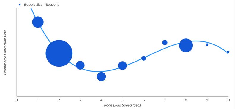
In addition, a study from Portent found that a site that loads within one second will get five times more conversions than a site that takes ten seconds to load.
The study also found that when it comes to e-commerce websites, the highest conversion rates occur on sites that load within two seconds or less.


So, if you want to prevent people from leaving your site before it even loads, and avoiding your site in the future because they can’t be bothered to wait, you’ve got to make sure your site loads quickly.
That being said, there are several things you can do to increase the speed of your website, including:
Removing unnecessary JavaScript
Running as few plugins as possible
Avoiding poor-quality WordPress themes
Ensuring your CSS code is properly written
Minimizing the number of elements on each page
Optimizing images and other elements by compressing them
Your business needs a high-performing website. So make sure your website is connecting you with your ideal customer by implementing these methods.
To your business success,
Susan Friesen
About the Author – Susan Friesen

Susan Friesen, the founder of the award-winning full-service web development and digital marketing firm eVision Media, is a Web Specialist, Business & Marketing Consultant, and Social Media Advisor. She works with entrepreneurs who struggle with having the lack of knowledge, skill and support needed to create their online business presence.
As a result of working with Susan and her team, clients feel confident and relieved knowing their online marketing is in trustworthy and caring hands so they can focus on building their business with peace of mind at having a perfect support system in place to guide them every step of the way.